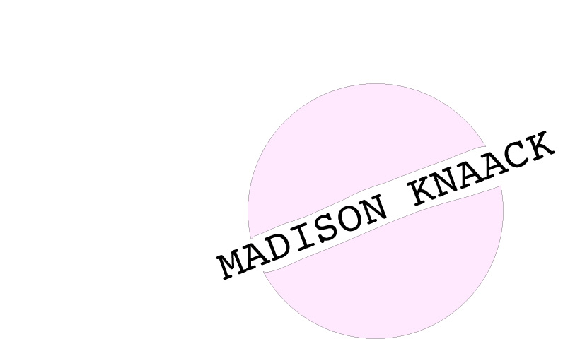
So obviously this could use a lot of improvement. I used the ellipse tool to make a circle and the text tool to write my name. I wanted it to be like one of the tutorials where one of the shapes was brought to the front, but I couldn’t remember how to do that nor could I figure it out. When I go back to the final logo, I want it to look differently, rather than having used the eraser tool to take the block out where the text is. I’ll probably have to go back and watch a couple of the tutorials, I did try to do this without the use of the tutorials to see how much I could remember. I just want the logo to be very simple with my name because my name is my brand in my situation. My website is meant to be all about me, and this logo includes my name rather than just “ALL ABOUT ME” because that could be about, well, anyone. I want it to be something that could be scaled down small like the YouTubers have in the corner of their videos a lot of the time, like a watermark, but also as the opening card scene (probably with some type of animation). I don’t love the way this came out, but it is what it’s meant to be: a first draft. I definitely need to spend some more time figuring it out than I did with Photoshop. I like the general idea with the circle because it is very simple, but I’m open to suggestions involving how to not use text and still somehow get the idea across that the site is about me and my life. I don’t know if I should stick with the idea of the circle and instead maybe I should use a rectangle or a rectangle inside another rectangle. I’m open to any and all suggestions.
