This logo is not the one I set out to create, but I personally feel like it’s better. I am absolutely awful with Illustrator and am not expecting to get 120/120 by any means, but I like the final result even if it took me way too long to create for what it is. It’s very me, super childlike. I don’t take life too seriously and honestly if this had to be the logo for my brand, it makes sense. It’s the doodles from my 10th grade notebook along with one of my current favorite colors. It works for me and for who I am. Yes, it could use a lot of work, but I don’t think my skills with Illustrator would improve without attending at least 5 master classes, and I sincerely hope I never have to work with Illustrator again because wow, it’s difficult to use.
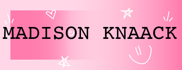
In my draft logo I used a circle and used the eraser tool to cut out the middle, but I mentioned in my paragraphs under the draft that I was interested in seeing how it could work with a rectangle, so I did that. I used the Rectangle Tool to create two rectangles, one big and one smaller inside it. I like what I did with the gradients, however I do feel as if it could look a bit smoother around the edges. Figuring out the gradients was probably the most difficult part, I just couldn’t get it to look the exact way I wanted to, close, but not exactly. I did go back and look at the tutorial videos, but it didn’t exactly show me what to do so I stayed pretty confused. After working with the gradients for way longer than I should have, I used the text tool to simply write my name in the middle in large letters like I initially thought to, I want them so large because even when scaled down you’ll be understand what it says. I then used the Paintbrush Tool to draw my little doodles.
All in all, I really like the simplicity of the logo because I like simple. It’s childlike and pink, giving a bit of insight as to who I am. And if who I am hasn’t been assumed by the pink and doodles, I throw it right in your face by having my name written in big, black, uppercase letters. Even the font of the text is simple but not as basic as Times New Roman or Arial. I love my logo and it showcases me well and who I am.
